Archives

Three Concept Paintings

Wednesday, February 11th, 2009

tigaer-design.com newsHere we have some concept paintings i did a while ago. The first two were done for a company in beverly hills to visualize some futuristic structures and places. More of less successful i managed to create some stuff for them. I, for my part, am pretty happy with the outcome. The third painting was done early 2008 for a movie project. All three of them were pretty small projects but nonetheless i learned some stuff on them.

conceptart

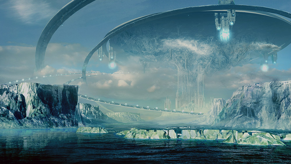
Solar Pole 1 – This one was fun to do. It was a first try of myself to create something icy, cold and snowy. The basics were rendered in vue and heavily overpainted in photoshop.

conceptart

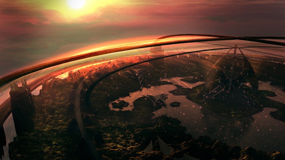
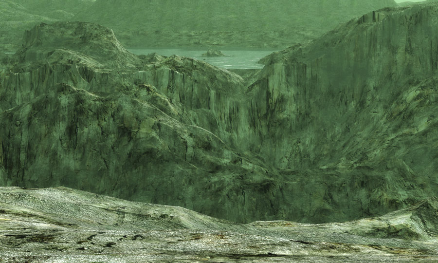
Solar Pole 2 – Here we’re looking, from above, onto the structure we see in the first painting. This is the one i’m not too happy with. Nonetheless, as usual, i tried a lot of things and catched up some new stuff.

conceptart

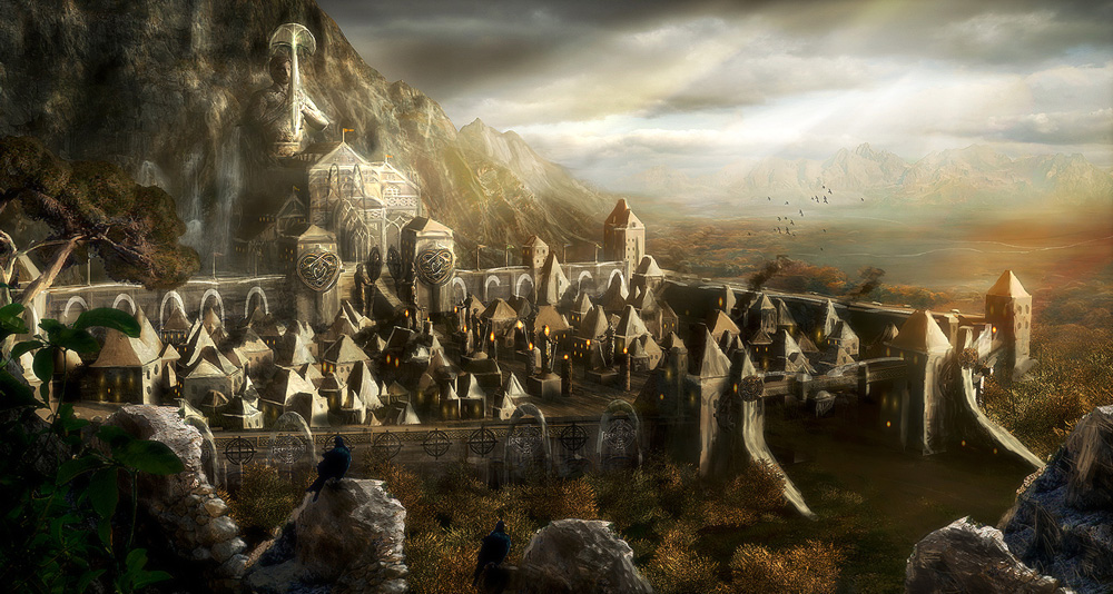
Eisental – A friend of mine is a screenwriter and was working on a project. He was asking me to visualize a place and i tried myself on it. Problem was that it had to be done rather quickly. I’m happy that i managed to do something half decent here. The overall image isn’t a blast but it contains some nice spots and a good looking lighting and depth.

Hope you can get some inspiration off of these. =)

Regards

signed

AEMPYREAN DECADENCE

Thursday, January 22nd, 2009


ÆMPYREAN DECADENCE

Imagine cities, that large that it all is built in levels. One on top of another. Like it’s kind of happening in Hong Kong today. Your position in society is reflected by on what level you live. Now this society has risen up so high that it couldn’t stand on its own feet anymore. Society, as well as the architecture, starts to fall apart. The ignorance of wanting it all more bigger and larger than large doomed them to break apart. Only a few search and rescue teams, all volunteers, mustered up the strength to go out there. Millions of people trappend in this catastrophe, finally realizing the downfall of their, once so strong and inspiring, empire.

Well, that could be one of many interpretations of what’s going on in the picture.

This one surely made it into the top ten of my fav paintings so far. It all started with a concept i made from the ship/transporter. I, earlier, had a small concept of a ruined futuristic city. Unfortunately never connceted to it. So i left it. First when i had this ship concept done i thought about creating something for the background. Much like on my ‘Descent Heart’ painting i started to see shapes i really liked. So this painting became a larger project. Above the basic painting i added tons of photo textures to suggest detail. Without wasting too much time on perspective. I tried to align everything very quickly… and good enough to make it work. Also used parts of the destroyed city concept i made earlier. So basically you could say that i was just throwing stuff together here… and looked how the cocktail may taste. Most of the time it was good. Sometimes not so much. Trail and error as usual.

The final result is pretty rough but still gives a lot of detail for the eye. The painterly style adds a lot and gives the eye something to do. I like it that way.

5760px wide – photoshop – intuos3 – 1 week

Regards

wallpapers available

signed

Mark Lovett Album Cover

Monday, January 12th, 2009

Mark Lovett, from UK, asked me to create a nice and slick cover for his musical endeavours. His concept was really appealing and something that fits right to my style. So i had this project done pretty fast. I really dig the outcome and hope it’ll help Mark to get the recognition he’s hoping for.

The pic itself started as a Vue render. After laying out the overall composition i moved into photoshop to refine the overall detail. Added painted elements and some good looking textures. Last but not least lighting fixes and a wonderful atmosphere. For the backside of the cover i basically took the front cover and manipulated it to make it look like we’re having the same peaceful scenery in a different daytime scenario/mood.

This project was fun! Oh and before you start to wonder… the song titles on the back cover are placeholders and from me. =)

Regards

signed

Comcept 10 – Hunting Party

Monday, December 29th, 2008


Comcept 10 – Hunting Party

This is the last painting for this year 2008. I have had a productive year and, like the years before, i learned a lot! The painting itself evolved from a test render i did months ago. I started to fiddle around with some brush strokes and soon got some nice shapes going on. I also started to design some flyers for the scene to add an action element to it. Worked out very well. In the end it is a nice addition to the comcept series… and a nice conclusion for 2008.

Enjoy this new world and the wallpapers!

3500px wide – 1 week – photoshop

The artwork on:
DeviantartArtstationDrawcrowdCGSociety

Regards

wallpapers available

signed

Burning Skies

Monday, December 15th, 2008


BURNING SKIES

A painting commission i recently got finished. As you can see it’s definitely settled in the fantasy regions of literature. And the painting, obviously, is a book cover for a fantasy novel. For this project i started with a 3d concept of the landscape, made with vue. I tried to match the ideas i got told and over the time i matched the idea nicely. Then i rendered the scene and started to add my postwork to it. Main goal was it to let it appear very moody and almost ghostly. Not a place where you would want to stay at night. Once the landscape was done i concentrated on the tower. Created the base of that in 3d again and integrated the tower into the mountains. All the postwork was done in photoshop. This commission was fun to do and relatively quickly done. I like it when that happens.

This pic is copyrighted by Chris Belbin and Tigaer-Design.com. Like all the other images on this site, this image may not be reproduced or used without permission!

Regards

signed

DESCENT HEART

Wednesday, December 3rd, 2008


DESCENT HEART

This piece was done by me using a very different technique than usual. It clearly is a digital painting. The painting started as a just for fun design like the ones you can find in my concept art gallery. I created a nice flyer and wanted to have a cool background for it. I started and… got into a flow. I really liked what was happening on my screen. The rough shapes becoming more and more detailed. Ending up in being a painting that shows a truly amazing environment. Sometimes you are surprised by yourself when you see the end product of a project. That’s the case here. Really like the result of this project. The rough look really adds to it as well. Working with custom brushes can really boost imagination. This painting was done in a very good time. I needed a good week to get it done. That’s pretty fast for me.

A work in progress picture can be found here.

The actual flyer design can be found here.

Enjoy this new world and the wallpapers!

5000px wide – 1 week – photoshop

Regards

wallpapers available

signed

Comcept 6

Tuesday, September 2nd, 2008


Comcept 6

Fiddled around in vue for this one. Like all the com-cept pieces this is a pure just for fun painting. Nothing too detailed… just there to roughly nail the idea onto the digital canvas. I like the result here. I think i got some nice depth in into it.

Original Specs:

3760px wide – 7 hrs – vue – photoshop

Vue Plate

wallpapers available

Regards

signed

THE FORSAKEN SOUL

Wednesday, October 17th, 2007


D³SCR!PTION

This actually started as a pure just for fun project. I really needed something to do for my head since the recent time was a plain pain in the ass for me. That kind of explains the dark title. This picture helped me a bit. I found that castle/fortress stock on deviantart.com and asked the owner for permission to use it.

I got permission to use the following stocks:

The-Gothic-Door

The-Arches-6

The-Postern-Tower

Thanks to causticstock.deviantart.com

So I accidently found that tower photo and started to play with it. Check some rough first steps here – somehow I got a drive for that pic and continued working on it. I did not go for my typical accurate way to work here. I wanted to keep it rough and sketchy. I made the pic for the atmosphere… not for the details.

When I came close to completion a friend mentioned “why not trying a night version”… I picked up the idea and worked out a second, slightly different, night version. The title here was chosen to help the viewer getting the right impression when looking at the pic. It’s night, dark, gloomy… you definitely don’t want to be outside at that god forsaken time. Then the cliché hits you with that howling wolf element. I think that brings together everything I intended for that night version.

TECHN!CAL DETA!LS

Technically there is not much to say here. I found a photo which seduced me to work something out with it. Like I mentioned earlier, I have a very kind of sketchy look going on in this painting. I made this painting not wasting too much time on details. I wanted to create a certain atmosphere with colors, shadows and lighting. So the pic is, of course, far away from photorealistic. Even if I used photo elements to work with.

When I was done with the pic I decided to create different color versions of it. I was not sure how I wanted to have the painting look in the end. I think I decided myself for that golden shine one because I don’t have anything similar in my gallery yet… and the colors generally fit, the idea I had in mind, most.

30hrs – intuos3 – photoshop – 5000px wide – 200dpi

Wallpapers can be found in the gallery.

See here for various concept stages.

Regards

signed

THE CITY OF LIGHTS

Monday, April 23rd, 2007


D³SCR!PTION

This one was actually planned to be a collab piece. Unfortunately nothing happened. Even with the lost collab i thought it could become a cool piece if i would finish it up alone. So i did. There is no big story behind it. I just thought i would play a bit with composition and lighting.

TECHN!CAL DETA!LS

As you can see it is a not too detailed painting. In terms of photorealism. Most of you know that i never seriously try to work photorealistic. With this pic my only goal was to create a good composition and a striking lighting. I maintained a concept art like look since i was thinking that it could help the overall atmosphere to come together.

30hrs – intuos3 – photoshop – 6000px wide – 300dpi

Wallpapers can be found in the gallery.

A special 1680×1080 wallpaper version.

Regards

signed

ANCHORAGE

Friday, December 1st, 2006


D³SCR!PTION

I’m waiting more than 10 years now, for that special day. Today i’ll make my first flight on a space cruiser. My dad told me the ‘lost hope’ once was a mighty battleship, diving through space nebulas, transforming enemy ships into spacedust. Named after mankinds biggest space battle. The fleet got almost completely vanquished back then. Only a very tricky maneuver by a very smart battleship captain made us win that bloody and dark fight. He got honored with the position as captain for the ‘lost hope’. Back then this ship was the beauty of the fleet. The most modern ship ever built. I can’t wait to set my feet onto that proud ship…

TECHN!CAL DETA!LS

This time i can’t say a lot. I actually started this one with the intention to create a speedpainting. But it evolved and i did not manage to leave my hands off of it. I quite like the result here. I maintained a concept arty like look to catch the dirty atmosphere of a futuristic space port a bit more. Basically digital painting with some photos used to bring in detail where it was needed.

30hrs – intuos3 – photoshop – 5000px wide – 300dpi